Categoría: Research & Reflection

Part 5 The personal project

Reflection on tutor feedback

For this final assignment I submitted three drawings related to the urban landscape. They were broadly influenced by the work of Leon Kossoff and in particular his Arnold Circus series. I was pleased with the comments received by my tutor and will use them as a guide for future work and for formal assessment.

Drawing 1 – The main avenue

The mark making you use to suggest the movement of the cars works quite well. Being economical with detail has helped emphasise the vehicles in motion. This also applies to the figures that are suggested to the left……..Compositionally it is well balanced with a good use of perspective. I also like the use of a limited palette with vivid colour only used sparingly in certain areas.

Using the work of Leon Kossoff was always going to be a risk in this last assignment as there is a lack of fine detail in his work – relying more on observation and expressive use of line with limited colour. I worked hard on my expressive mark-making and use of a wide range of media throughout the course and this has shown through in this work.

Drawing 2 – Plaza de las armas

The figures are well rendered with subtle suggestions of movement. The use of shadow is strong and effective and there is some delicate linear detail where you describe the building in the background and the lamp post to the left.

I have always liked images with people and movement, and this was an opportunity to include elements that I enjoy rendering. Leon Kossoff has many figures included in his works – some hidden, or made with light gestures – others more obvious. He also includes subjects that he has used for portraits and figure works – even family members.

Drawing 3 – Terminal O’Higgins

You use a slightly lighter touch here and the results are quite effective. You are
allowing the linear qualities of charcoal and pastel to inform the results and avoiding too much blending – except to suggest shadows. Again, the moving vehicles and figures are well described with subtle, fragmented mark making….You have made some strong preliminary work for this piece. The bold pencil sketches work very well, they have a real confidence.

I enjoyed the preliminary work for both this and the main avenue drawing. I now realise more than before the effect of better preparation and sketchbook work to influence the outcome and quality of the final pieces.

There were some obvious points that I will need to improve upon such as:

  • Avoid overworking – step back more and think about what benefit or effect additional marks and layers will have on the final outcome.
  • Observe more closely the forms/elements of the scene before making rapid energetic marks – if necessary make more detail sketches prior to final drawings.

Sketchbooks/Learning log

It is good to see you using your sketchbook more rigorously, making some lively,
energetic studies of your local environment – this has helped you develop your ideas
for your final project. Your quick sketches are confident with an active quality of line that is engaging.

I worked hard on my sketchbook work and the learning log – I will continue to develop this further to reinforce future coursework.


Part 5 The personal project

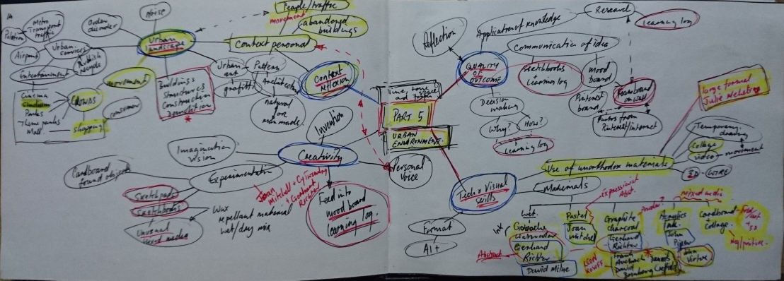
Reflection on Part 5

Demonstration of technical and visual skills

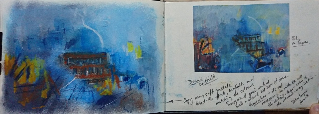
I have continued to experiment with different media – in this part I tried different types of graphite and would like to explore this more in future. I also experimented with oil pastel on mylar and started to use gouache for the first time. Finally I settled on using soft pastel and charcoal for my final pieces.

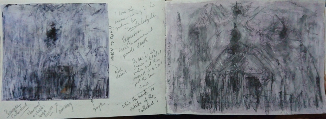
It was apparent from studying the works of Frank Auerbach, David Bomberg, Dennis Creffield, John Virtue and Leon Kossoff that observational skills are key to the success of their work – sketching obsessively over a long period of time – on location, in the street (or rooftop) to use as a final work, or as a study for much larger painting projects. I did not feel comfortable in taking an easel and large board outside in the street – which may have required a second person with me for safety/security – so stuck to making sketches in my A5 sketchbook and a sketchpad – transferring these to larger sheets at home.

My use of the sketchbook has been limited during this course and for Part 5 I have filled a sketchpad with ideas, experiments and location sketches – nearly all related to the Urban Landscape.

My experience of drawing outside particularly with moving traffic and people was interesting and enjoyable – I found myself drawing blind to capture as much as possible:

The above was an experiment in drawing moving traffic – it is interesting how accurate you can become by practice.  This is also a good exercise for brain/hand coordination.

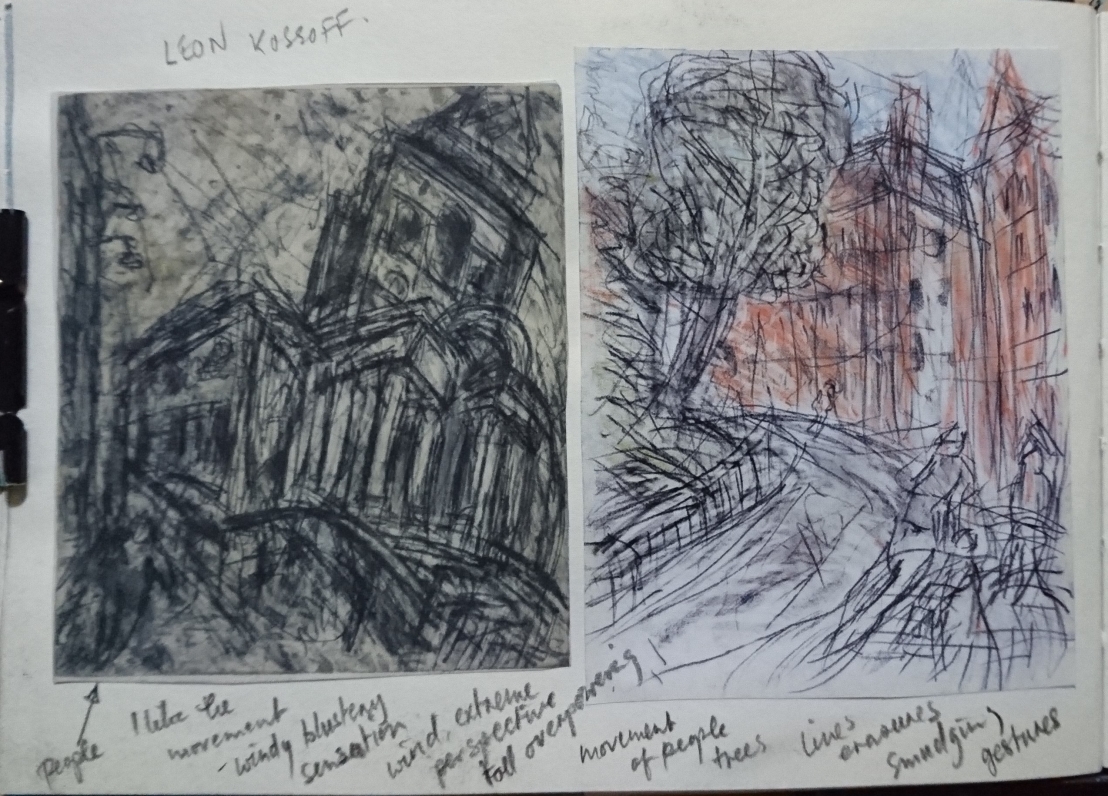
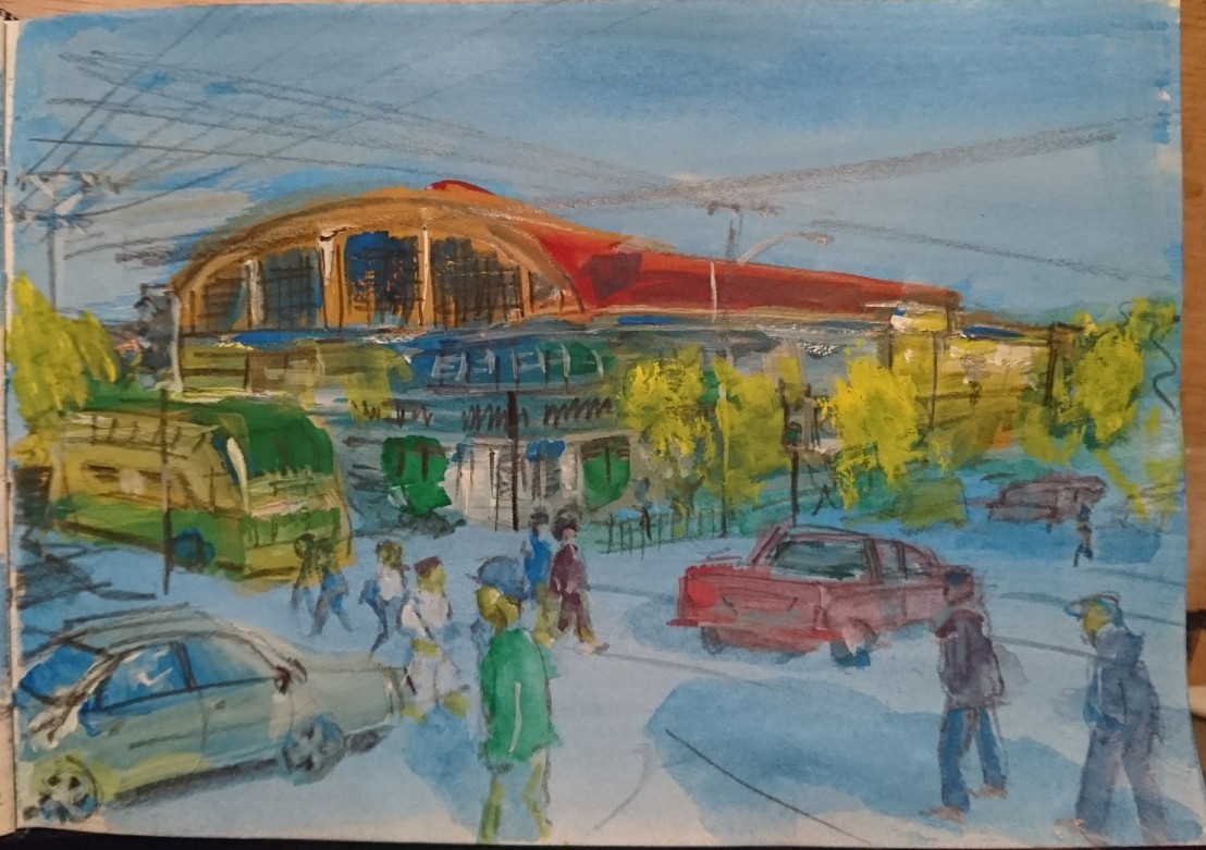
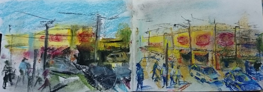
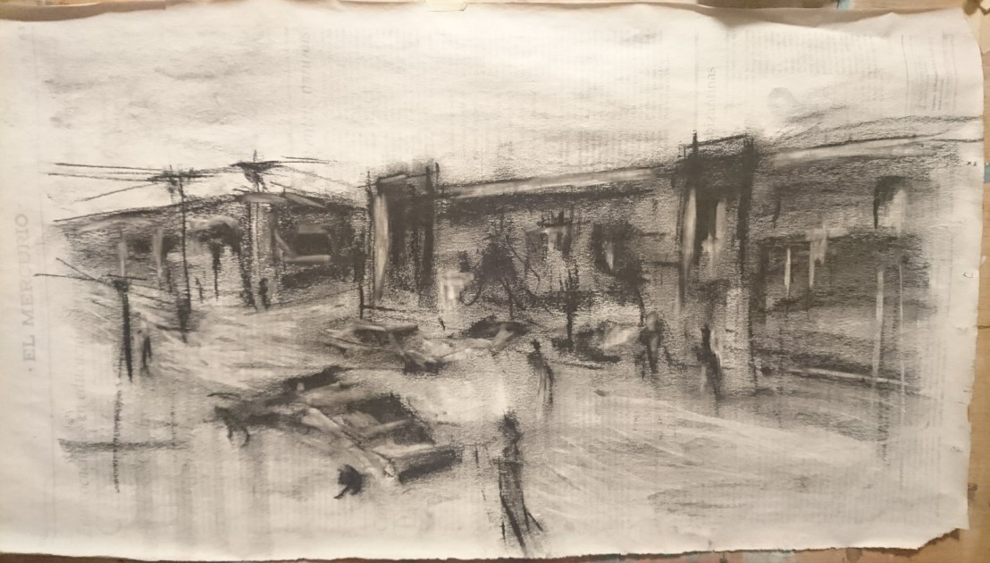
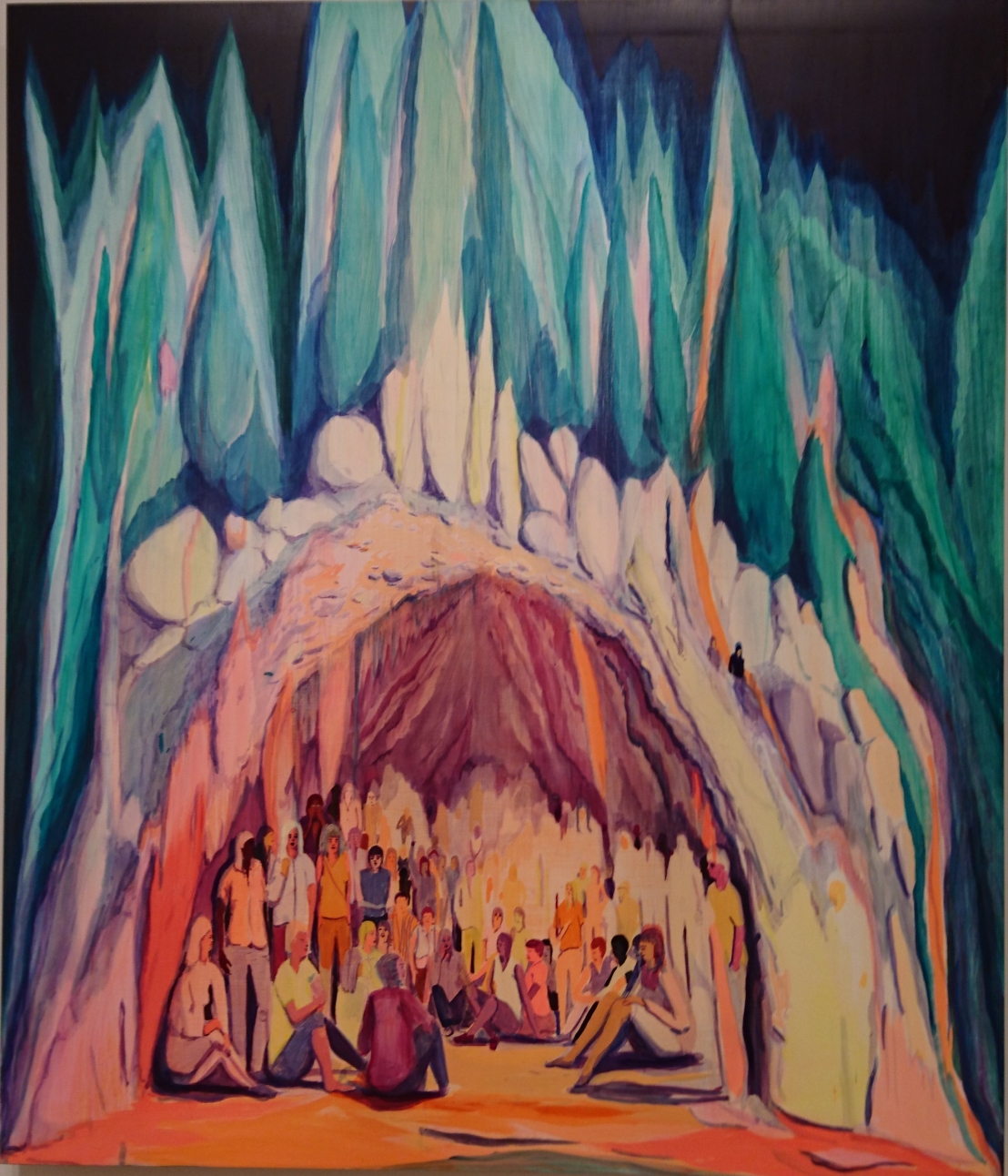
In my final pieces which have been influenced by the work of Leon Kossoff, I have included a great deal of information, detail and also movement – movement in line and subjects, such as people or traffic. I believe that this was successful and captured the atmosphere and colour of each chosen site.  One of the comments during the coursework was if something did not seem to work – keep drawing – this really helped me, as these final pieces required patience and a building up of layers of colour, of detail and tonal variation.

Kossoff’s work includes many fleeting details – sometimes blindly drawn, often difficult to discover but still there in his drawings and paintings. I have also included these type of details in my work – moving cars and people in the main avenue, people standing at the bus stop in the terminal and people chatting, reading and moving about in the main square.

My compositions were very similar – in a wide-angle triangular format that relied on diagonals and employed the use of foreground, middleground and background details to assist the viewer in moving around the drawing.  I was conscious of the viewer as I constructed the drawing to include as much detail and interest as possible without overworking the drawing.

After experimenting with various supports – both smooth and textured and the relationship between line/mark making with these supports, I chose to use a Fabriano paper for the final works with a medium grain to be able to hold more layers of pastel and to allow for a more expressive broken line in both pastel and charcoal. This choice was a good one – this paper being excellent for pastel work. I did try a Strathmore Bristol heavyweight paper with a smoother vellum surface which could also have worked but not exactly what I was looking for on this occasion – When pressing the pastel and charcoal hard on this paper, the mark-making was without grain – with a lighter touch grain is apparent.

Quality of outcome

I was very careful during this final part of the course to heed the advice and guidance giving both by my tutor and the course content in general with respect conceptualisation of thoughts, communication of ideas and application of knowledge gained throughout Drawing 1.  This I believe I have achieved and in particular demonstrated in arriving at my Main Avenue drawing – with several sketches, different ideas – relating these ideas and outcomes to my original concept/research of Leon Kossoff’s work – and incorporating improvements and a little of my own voice in the final outcome.

Leon Kossoff’s work encompasses a lifetime’s work in drawing and painting his immediate environment in all weathers and different times of day – this was obvious in his masterly use of line/brushwork in capturing the atmosphere, movement and details of his subject matter.  Appreciating this after studying for this part, I will take this forward into my work for POP1.

The most successful drawing in my series of three was the Main Square because of the range of tones, colour, detail and atmosphere captured in the scene.

Demonstration of creativity

During Drawing 1, I have been criticised for overusing line to describe form, where greater tonal contrast would have been more effective.  For me therefore using Leon Kossoff was a risk, as he uses heavy line/mark-making in his drawings – particularly in his Arnold Circus drawings.

In taking this risk, I have demonstrated that it is possible to combine a tonal background with expressive line – and that the building up of layers of dark and light colours/tones to describe form coupled with expressive line can work.

I am beginning to have a personal voice in both style and in subject matter – this personal voice has a long way to go yet and I intend to continue with OCA studies to continue improving and building on everything that I have achieved so far.

Context reflection

During the course of Part 5, I visited 4 galleries, 3 in London and 1 in Santiago. In the next few weeks I have an opportunity to visit galleries in Taipei and Shanghai. I have reflected on 4 important exhibitions within the galleries visited and have also watched several important art videos on YouTube – one memorable video was on the work of Tawara Yusaku – a Japanese artist who worked for the latter part of his life exclusively in ink.  I hope to see similar ink and watercolour works in Taipei and Shanghai.

Tawara Yusaku

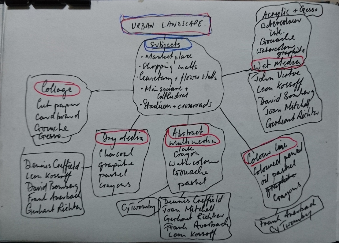
My research into artists working in the urban environment was limited to those who either worked/studied together or whose work was influencial upon each other – they have been mentioned before but I believe that David Bomberg was a catalyst for all of them and it was a shame that he was not recognised sufficiently during his lifetime.

My interest in the work of Leon Kossoff (and Frank Auerbach) can be further developed during POP1 – in particular I have an interest in gouache and watercolour – a medium that Kossoff used often, in addition to his work on the human figure and portraiture.

My learning log has improved in that it is starting to be much clearer in demonstrating my thought processes and journey to final pieces.

In POP1 I intend to separate the learning log from the coursework/exercises and have a separate section in the blog for a sketchbook/sketchpad gallery.  The idea is to be much clearer in my working processes/experimentation.  It is also my intention to change the format of the blog into a fully working website.

Conclusion

In my artist’s statement which I used as the basis for my work on the Urban environment:

Combine line, space and form to create depth, movement and atmosphere in the urban landscape exploring a wide range of media to include graphite, charcoal, pastel, ink, markers, crayons, water-based paints, and collage.

The final work will be a series of up to 5 urban landscapes in a chosen media or use of mixed media.

I believe that I have fully met the brief that I set for myself – I feel limited only by time and want to move forward on to the next module of the OCA Painting course.  I feel that I have only scratched the surface of what can be achieved with drawing and drawing techniques.

In my 3 final pieces I created unique spaces with their own lighting, movement and mood. This was created using colour, incorporating detail/interest and incorporating greater depth by the use of tonal contrast and complementary colours.

I chose dry media for these final works but in POP1 I hope to have the opportunity to explore wet media in the Urban Landscape on a variety of supports.

I could have included 5 works for Assignment 5 but limited it to a series of just 3 as these were my strongest pieces.

Part 5 – The personal project

Part 5 – The personal project

Early research and experimentation

I started this part by brainstorming ideas for the Urban Landscape:

dsc_3217.jpg

From this very busy and too overwhelming chart, I made another more specific one:

DSC_3230.JPG

I heaviliy studied the catalogue of Leon Kossoff’s London Landscapes and was intrigued by his frantically scribbled drawings and Gouache paintings – I stuck some in my sketchbook:

dsc_3218.jpg

and then made a larger copy of one of his drawings of Arnold Circus…

_20180519_220636.JPG

I used smooth paper to allow me to blend the pastel and to make marks with the charcoal with as least amount of grain as possible. Using a slightly bigger scale showed me just how skilled Kossoff is – the amount of mark making and range of mark making needs to increase considerably.  I did not achieve this in this piece of work but gained a sense of what is required.

Studying further I came across Dennis Creffield who went to the same evening classes as Leon Kossoff and Frank Auerbach – their teacher was David Bomberg, whose famous charcoal drawing of St Pauls rising from the ashes of bombed out London – his use of charcoal (burnt wood) significant – was obviously a strong influence on both Dennis Creffield, and much later John Virtue, in their drawings/paintings.

The following pages from my sketchbook show copies of Creffields drawings/paintings:

DSC_3234.JPG

DSC_3225.JPG

I particularly liked these drawings as they allowed me much more freedom in mark making and representing forms in a more abstract way.

Going back to Kossoff, I experimented a little with gouache and used the following as a basis for this investigation

dsc_3228.jpg

dsc_3229.jpg

I used gouache, soft pastel and charcoal.  Kossoff made many versions of this scene all around 70 x 90cm, my version is just A5. I did however make the following observations:

  • He has typically used a high viewpoint
  • All his versions were made in gouache with one in oil
  • He makes use of contrasting/complementary colours
  • He uses several layers of colour to build up his base for the image and then uses heavy dark gestural linework or dabs of paint to complete the painting.

I did not continue with this line of investigation as I saw it as more painting than drawing. I hope to get the chance to explore this again in POP1.

At this stage I also explored the use of collage on its own and building it up more with graphite and pastel:

DSC_3235.JPG

Local marketplace, Rancagua

I sketched in my local marketplace and then worked from photographs in pencil and gouache:

_20180415_213748.JPG

and pastel:

_20180520_220139.JPG

I liked the colours which reminded me of one of Frank Auerbach’s paintings which I then copied in oil pastel on mylar:

_20180425_220935.JPG

The effect of oil pastel on mylar was interesting but difficult to control and maintain clean. It is something that I will try and take further in the future.

Finally with David Bomberg and John Virtue in mind, I made a black and white sketch of the scene using charcoal on gessoed newspaper:

_20180415_213849.JPG


References:

  • Leon Kossoff, London Landscapes – Catalogue
  • Frank Auerbach, Speaking and Painting by Catherine Lampert

You tube videos:

  • BBC Four, British art at war – David Bomberg
  • Leon Kossoff, London Landscapes trailer
  • John Virtue, London paintings and sea paintings


Study visit: Victoria Miro Gallery and Gagosian Gallery, Mayfair

Study visit: Victoria Miro Gallery and Gagosian Gallery, Mayfair

Victoria Miro – Jules de Balincourt Exhibition

I had never been to a commercial private gallery before, and also did not know that these galleries existed in Mayfair. This was therefore a first for me and an area that I shall visit in future.

This was my first time on a study visit and found the interaction with other students and also direct contact with a tutor – Hayley Lock – very helpful to me.

img_20180317_123850-e1525217950315.jpg

The paintings by Jules de Balincourt – were all painted in oil on smooth untextured panels. The paint was applied in thin transparent layers. His subject matter we were told is based on American news items but it seems in a very ambiguous and somewhat mysterious way.

All of the paintings included figures, many zombie like and on occasions of contrasting sizes – very small and giant – as in Big Little Monsters, 2017 and They Cast Long Shadows, 2017.

DSC_2595
Jules de Balincourt, Cave Country, 2017. Oil on Panel

The use of colours in my opinion is based on the bright daylight of California, something I am more aware of – travelling around the world.  Artists often change their palette according to their location/local environment.  Balincourt’s paintings appear unfinished and he must have great courage to say – that’s enough for this painting – they are certainly not overworked paintings! Another aspect to mention is the format – there were three large paintings approx. 1.7×1.5m however many were a much smaller format down to 61x50cm.


IMG_20180317_124602
Jules de Balincourt, Troubled Eden, 2017. Oil on panel (detail)

In the above detail of Troubled Eden – a disturbing title and mysterious painting – you can see the very thin layers of paint, scraped over with sandpaper or scourer.  The painting has some connection to catwalk models and a not so perfect paradise?

My favourite paintings from the show included If trees spoke and we listened and They cast long shadows:

DSC_2597
They Cast Long Shadows 2017, Oil on panel

There is an effectiveness in his interplay of transparent and opaque paint, and his use of detail in the smaller figures and buildings contrasting with the larger figures that have an absence of detail.

I made my own version using collage and marker pens:

_20180505_225148.JPG

Gagosian – Glenn Brown Exhibition

This was a wildly different exhibition, much bigger with line drawings, large oil paintings and sculpture.  Each artwork was made to fit carefully chosen elaborate, antique frames.

I use pre-existing images to go into pre-existing frames. I don´t like a blank canvas or a blank sheet of paper – Glenn Brown

The whole exhibition works were completed in just one year – a massive undertaking and one when you see the level of detail in every drawing, and the research into the master paintings used as the basis for many of the works, is awe-inspiring.

The exhibition space smelt of oil paint – as some of the works were obviously not completed dry! I was interested in the drawings made with indian ink and acrylics on drafting film (mylar) – as this is a support that I have been experimenting with. Also whilst there is terrific depth to Brown´s paintings and drawings – they are all made on smooth, flat surfaces.

His combined use of thin lines to create what appears from afar as larger brushstrokes is impressive – he is in some cases achieving the same effect as for instance Frank Auerbach’s thick impastos using brushed thin lines on a flat smooth surface.  By contrast he then produces a series of sculptures that are built up of thick impasto brushstrokes of oil over acrylic paint.

To me there is obviously an element of digital manipulation in his drawings and oil paintings – particularly in the oils the backgrounds appear almost photographic, unreal even. His drawings in which he combines two or three different faces in one are another example.

I am a great fan of the work of Frank Auerbach – so this exhibition was interesting in that it showed a different artist’s method to achieve a similar effect but on a different support and completely different style of brushstroke. It also provided me with more ideas to develop my work on Mylar, in addition to complementing a new discovery from Japan – the work of Tawara Yusaku, who worked on a small scale using ink and built up what appears to be one larger brushstroke using a small brush with up to maybe 200 smaller energetic brushstrokes which he completes almost unconsciously and repetitively like a buddhist chant:

Tawara Yusaku

I have also been trying out his technique, of creating horizontal lines (I-chi) with a small No. 1 sable, indian ink and rapid, energetic brushstrokes – the upper example is with one charge of paint on the brush, the lower one using multiple charges of ink:

_20180506_084036.JPG