Etiqueta: landscape

Part 3 Expanse

Project 5 Townscapes

Research Point – John Virtue and Robert Birmelin

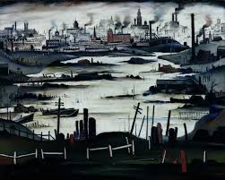
I am very interested in the work of John Virtue – especially his large London works. I particularly like the way he paints a sillouette of the scene and then using marks/textures and the light on the landscape to build up very complex layers of interest – his mark making is very much that of an action painter (Jackson) – dripping, rubbing, spraying – large and small gestures – and his influence of Turner and Constable, painters well represented in the National Gallery Collection. Virtue uses many sketches and works also from his memory of the scenes he paints – reiterating the importance of a sketchbook and sketching – in both tone and line:

john virtue sketch 3
John Virtue – London sketches
John Virtue sketch
John Virtue – London sketches

john_virtue painting

There was another link that interested me – that of his contact and interest in the work of Frank Auerbach who was taught by David Bomberg, an artist that painted scenes of Blitzed london after the war.

Air_Raid_Damage_in_Britain_during_the_Second_World_War_HU36220A
Photo of wartime London during the Blitz

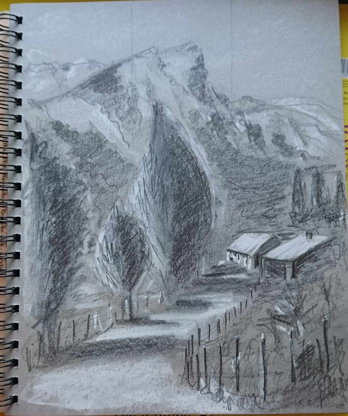
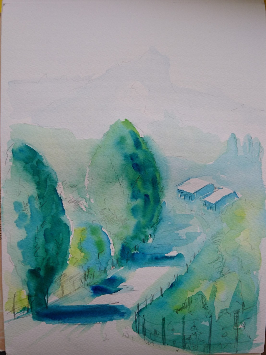
I my own drawings below there is evidence of a fight between nature and man – and man’s imposition on the landscape both rural and urban. John Virtues images are more cruel and stark – stripped of what he calls the ‘White noise’ and absent of people – just himself against the landscape and elements.

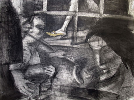
Another artist of great interest to me is Robert Birmelin who uses the urban environment as his subject matter. I am interested in his use of overlap/transparency to depict not only perspective but movement and the passing of time.

15147637788631096647726.jpg

In this example people pass by in the metro, the transparency recording different moments in time.  The eye line position strategically placed with the viewer looking across a stairway – in which the subjects are moving past at different heights both near and far adding an extra level of interest.

I intend to find a use for this approach in my urban landscapes and also in Part 4.

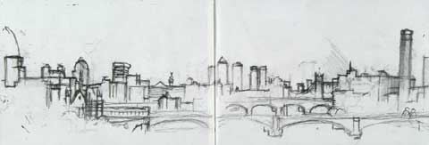
Exercise 1 Sketch of townscape drawings

I went out early in the morning to produce these drawings to make use of the shadows produced with the sun low in the sky. I found it difficult to find a comfortable place to sketch and many of the drawings I made were done standing. My favorite place was an abandoned petrol station which I sketched and photographed for future use.

The left hand sketches (not good photographs) were made standing using a 3B pencil within a 10cm square. The RH drawing was a quick sketch in the style of Frank Auerbach. Light was fairly strong and low from the RHS. There were some very clear tones of both white and black – as can be seen in this B&W photo taken from a slightly different angle:

DSC_0568 (2)

Before leaving the scene, I took many photos at different angles and distances to use later. It was also beginning to get very hot so I also decided to finish sketching for the day outside.

I also made  similar drawings of the side of a church in the same street:

_20171208_181122

I spent more time on these drawings sitting down on the opposite side of the street. At first there was hardly any traffic and the street was quiet and peaceful.  As I finished the drawings there were more people about and the traffic started to build up. This is an interesting building but difficult to find a good/safe viewpoint. I included a couple of figures to give a sense of scale to the drawing.

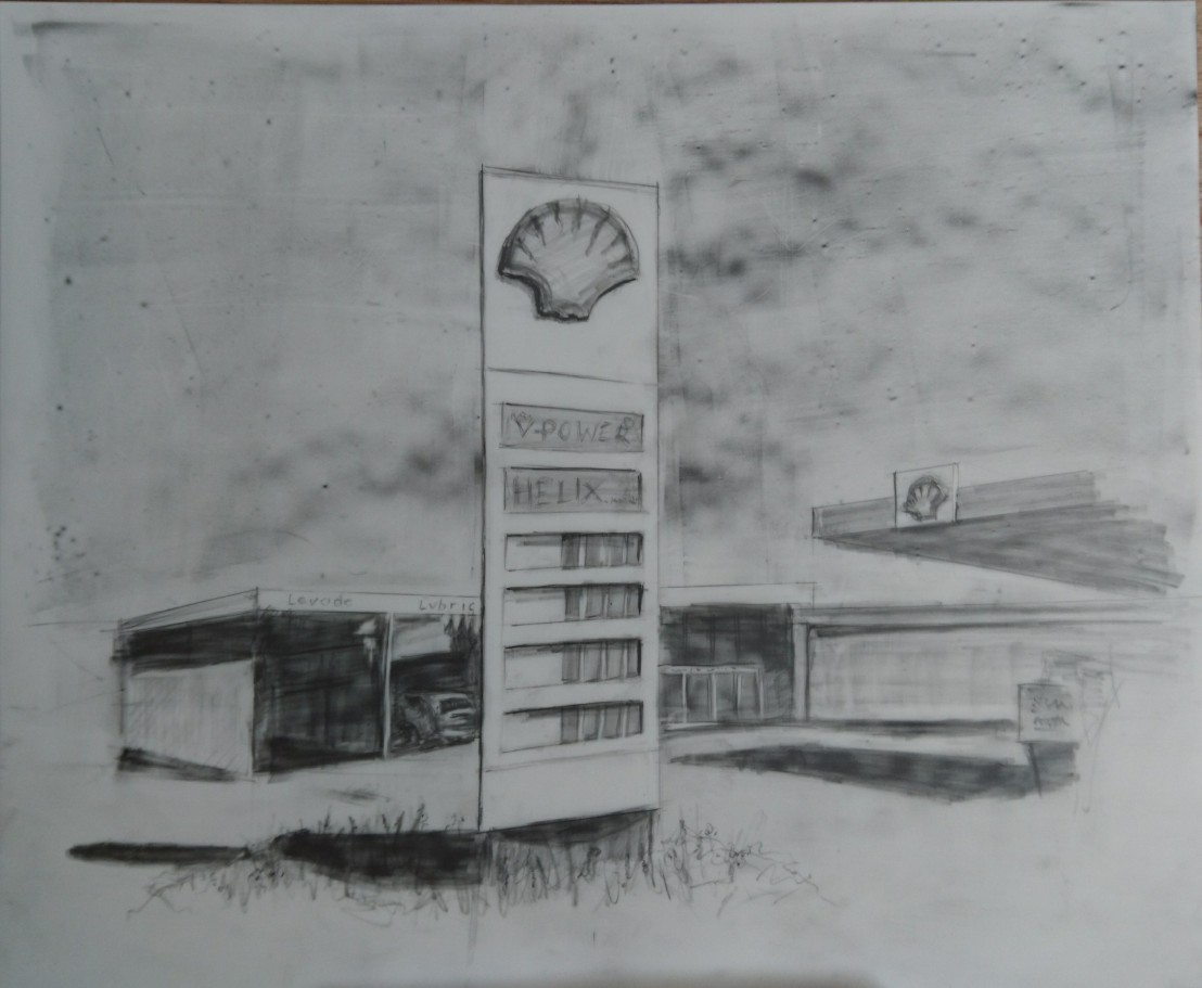
I decided to take the petrol station drawing further.  It intrigued me as this is a very busy street and very close is a very large workshop/school for the Copper Mining Industry – the principal industry and the biggest employer in the area. First thing in the morning it is peaceful and quiet and this pertrol station – deserted – is a strange sight among the hussle and bustle. The morning was warm, no breeze, clear blue sky, and ideal for this type of scene – deep shadows and very bright highlights. I wanted to experiment with mylar further and I liked the effect of pencil on mylar – so wanted to try graphite/coloured pencil.

This exercise was more about shapes and shadows etc so my line drawing with the central sign was ok but was only suitable if drawn tighter. I did however try out the effects on mylar:

Both drawings were to loose and drawn very quickly – also the coloured pencil ws muddied by the layers of graphite. In the RH drawing I used a graphite block to fill in rather than pencil and I liked the effect and depth of tone.

Final drawing:

_20171210_093343

In this drawing there is a feeling of abandonment, the expanse of sky also assists in the eerie feel – no ,ovement, no people, the only sign of life a car – also abandoned. I was not shy in my use of tone and have used a wide range from deep black to erased white. After finishing the drawing I saw that there may have been a better composition!

DSC_0827

This crop does not have the same sense of space and abandonment but is a better stronger composition. I should think more about this type of opportunity in future.

Exercise 2 Study of townscape using line

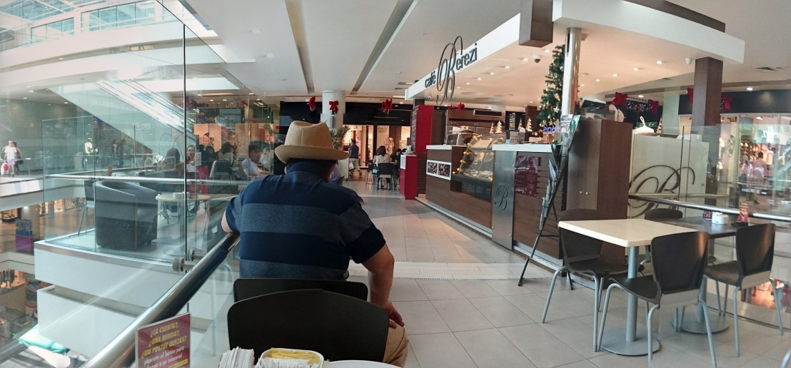
In this exercise I found that I did not have much patience in detailed sketches of buildings. I found myself wanting to rush them except when people were involved – this excites me more – movement, the hustle and bustle of the high street. I took a break for a coffee and sketched in the cafe/mall – this interested me more than the churches outside.

DSC_0832
Fineliner in black and red

This was a rather hurried sketch – there were problems with scale and perspective which may have led to my impatience in finishing this sketch. This the main church in the town and is placed in an historically famous square – famous for a battle defeat against the spanish just before the independence of Chile. I sketched in the morning on a warm day with strong directional sunlight – the square is difficult to sketch due to many trees placed around and infront of the buildings – which lends itself to cropped details only.

DSC_0840
Brush pen and coloured pencil

This second sketch using a brush pen and coloured pencil would have been better worked on a larger sheet of paper with charcoal or ink washes.

I went for a coffee and sketched the cafe in an open mall which I enjoyed – there was great potential here and the opportunity to include people and movement:

dsc_0831.jpg

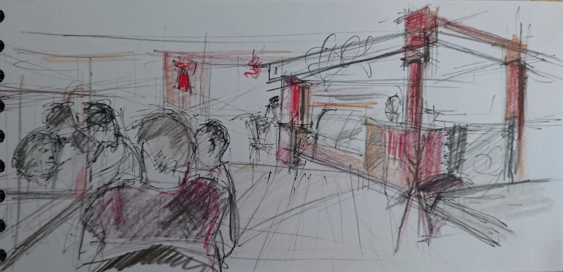
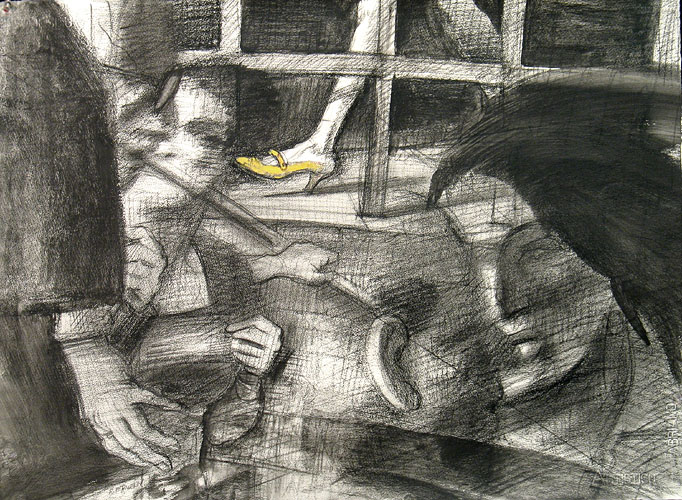
Whilst sketching here I was reminded of the drawings and paintings by Robert Birmelin and his use of transparent overlapping images – For instance his Study – Steps Series, Yellow Shoe 2005. Black chalk, conté pencil, and acrylicwash on 90lb cold pressed Fabriano Classico:

yellow_shoe

I took several photos to use as reference including this panaramic shot – there is a temptation here to overcomplicate – but the Birmelin example shows that simplification is key in what is really a complex drawing:

DSC_0782-PANO

After this coffee break, I went back to the square:

DSC_0838
1.4mm grip pencil – 3B

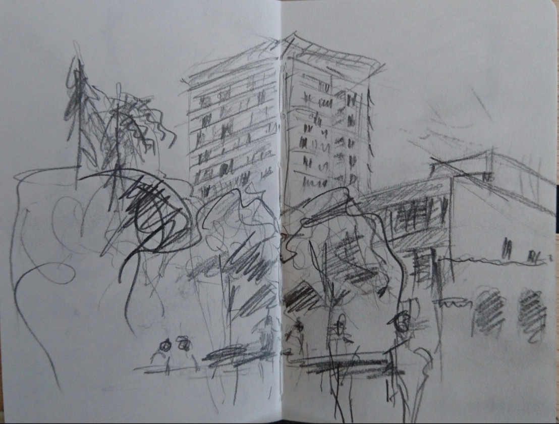
This view also had potential for taking further and I liked the inclusion of people in the foreground, middleground buildings and tower block in the background.

Moving on to the main thoroughfare I enjoyed making rapid gestural sketches of the movement of people and a band playing.

DSC_0837

DSC_0836

Out of all of these sketches I wanted to take forward the main thoroughfare sketch – an opportunity to include people in an urban environment – I do like the movement of people in drawings/paintings:

_20171217_220159 (1)
Charcoal and soft pencil on 250g mixed media paper

The day was hot and the shadows harsh, the main thoroughfare was busy with people rushing about – I love making quick drawings in this type of environment.  I should have spent more time drawing, but took several photos that I montaged to get the feel of movement and perspective that I wanted in this final drawing.

Some of the marks I made were erratic and not as balanced as I would have liked – also maybe I should have stuck to just charcoal alone. The drawing was made on A2 but A1 would have suited me better – I did feel a little restricted. The shadows on the left under the tree were poorly made and should have been deeper, the trees were drawn in a manner not reflected in the rest of the image and on this occasion (using line) I felt uncomfortable trying to use just line without some form of tonal contrast.  I started the drawing by building up a level of tonal contrast smudging charcoal with my fingers before using line – next time I need to go for greater tonal contrast at this point.

Exercise 3 A limited palette study

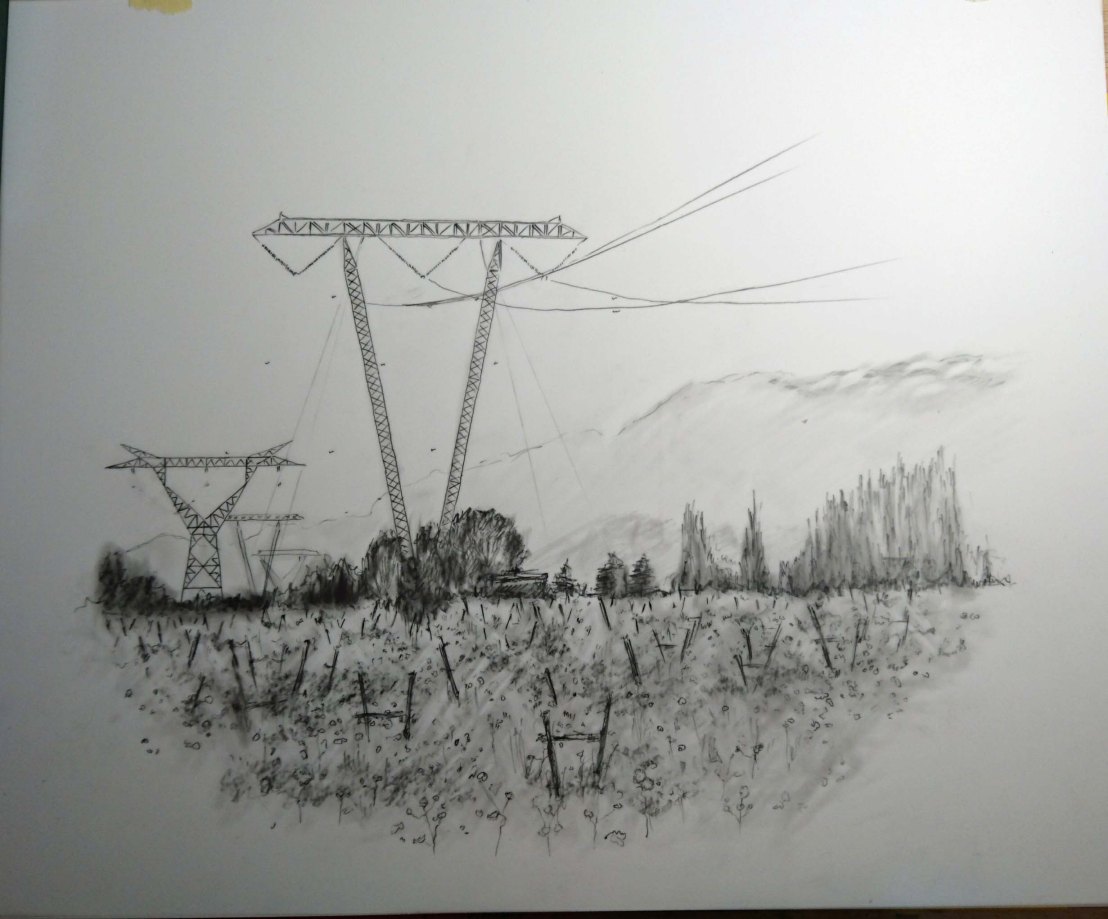
Every day I pass the local football stadium in my car early in the morning and on my return from work – I had noted this as an interesting subject. Located in the same street as the abandoned petrol station it has alonside it around 5 very large publicity towers and there a more further up the street – something I that to me seems an invasion on the landscape – a bit like my early protest of the electricity pylons in a field. There is another interest for me in the drawing – on the bottom right – in the traffic light junction. An attraction possibly due to travelling a lot and having had a great deal of changes in my life – crossroads and paths taken (or chosen for me) – like a motif.

The limited palette study was drawn using a mixed media of charcoal and pastel on a heavy mixed media A2 sized paper prepared with a backgound of blue/ochre gouache.

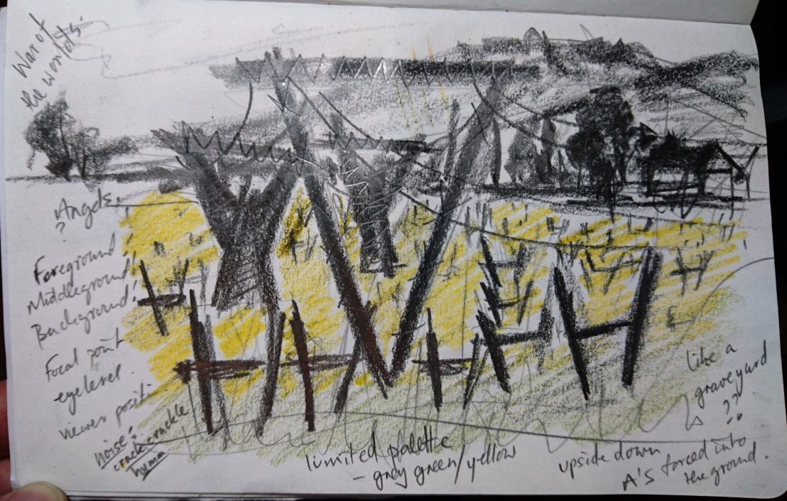
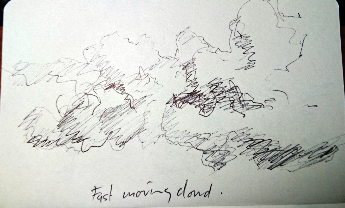
I have started to use my sketchbook more and during the week had taken some photos of the stadium from my car. I made fast sketches of these photos using a 9B pencil whilst thinking of the John Virtue London paintings:

I then went out early in the morning and made two more sketches in my sketchbook – on pages previously prepared with newspaper collage:

DSC_0924

DSC_0923 1

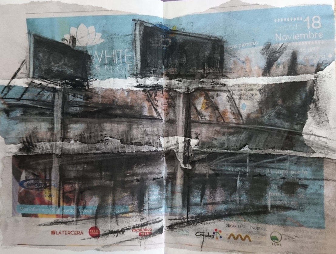
I decided to take these sketches further to use as the subject of my Limited Palette Study:

DSC_0928

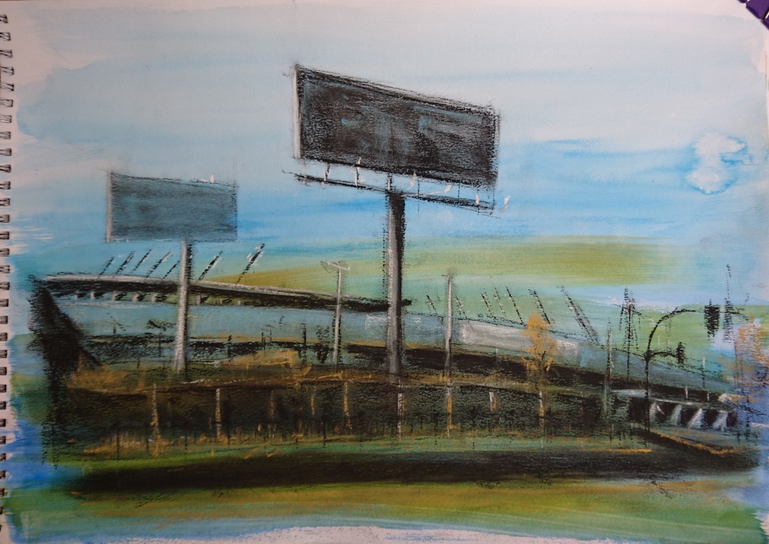
The drawing was completed using blue and ochre pastel with black charcoal, but because I had used a blue/ochre gouche background – I had to include the use of white pastel for highlights.

As a study to create depth using a limited palette – I had given myself too bigger a challenge and did not consider this enough in the choice of subject and the construction of the composition. There were some very complicated angles/curves and I did not consider the lines/angles of perspective as in earlier drawings.

It is possible to use a limited palette to create depth and in hindsight I could have toned down the LHS stadium stand – drawn in dark charcoal – perhaps this could have been a darker blue but without so much detail. Being early in the morning – there was no traffic and nobody in the street – giving the scene an abandoned feeling!

Exercise 4 Statues

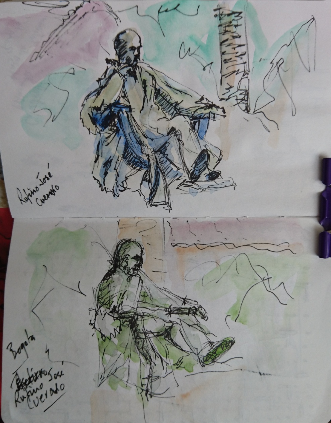
During my trip to Bogota, Colombia I was able to sketch some statues – one was the main subject of a quick pen and watercolour sketch I made of Parque Santander:

DSC_0931 I then found a lovely garden square in front of some old buildings – just off of Plaza Bolivar – a statue of Rufino Jose Cuervo. I made two pen and watercolour sketches from different angles:

DSC_0932


Part 3 Expanse

Project 3 Composition

Exercise 1 Developing your studies

This was an interesting part of the course for me and I am not quite sure that I have achieved what is expected at this stage. After reading Contemporary Drawing by Margaret Davidson, and researching Julie Mehretu I thought that I had increased my range of tools and techniques – maybe I have…but not consistently. I am though more aware of my goals.

Firstly, I picked the ‘Abandoned field’ sketch from my sketchbook walk to develop further. I liked the repetition of the shape of the pylons in the wooden tree frames in the field. I also felt a connection with this space – I used to walk in open fields when I was about 9-12 years old – often with a sketchbook.  The pylons are a connection to my engineering training and an imposing manmade structure in a rural landscape – something that is not often seen in for instance an English landscape. Their were other connections like my interest in aliens and HG Wells’ War of the Worlds – the pylons as the alien invaders, and my weekend bike rides which pass this field.

When in the field sketching, I sat on a stool with a very low eye level – see sketch in Project 2. I later made a watercolour sketch but took up a standing position with easel. Additionally I took many photos to review compositional possibilities – all whilst standing!

It was interesting to note that the initial sketch shows the pylons touching the top of the page – towering over me, but in the watercolour, the pylons were not so imposing and my eyelevel was higher and looked over the field from the outside.

DSC_0779

I made a pencil drawing in my sketchbook using as a guide the above watercolour and made notes of my feelings about the drawing:

DSC_0090

There were several interesting notes: the use of a limited palette, the smaller pylons reminded me of angels, there was also a feeling of being in a graveyard, the noise of the cables – a crack-crackle/constant humming, and lastly something I may take forward the theme of the letter A upside down forced into the ground.

I decided to experiment with some new Duralar sketchpads bought in the USA. One was for dry media and the other wet media – this trial drawing was by memory – note that I painted the big pylon upside down!:

_20171028_104009_20171028_104031

There were some interesting marks and I liked the indian ink washes that I made in both versions. I need to explore this combination of ink and gouache on Duralar again.

Then I decided to make a finished drawing using a 2B Pencil and coloured pencil on Duralar for dry media combining traced elements, erasing, drawing over erasures, working on the composition, including foreground, middleground and background, and finally including geometric shapes drawn with coloured pencil on the back of the support – using its transparent quality.

_20171029_203624
Original drawing without coloured elements
_20171029_203705
Drawing with geometric shapes drawn with coloured pencil on reverse side of Duralar Film

Relating this final piece to my recent research on Margaret Davisons book on Contemporary Drawing:

Have I shown the relationship between negative spaces and the forms?  The negative spaces in the sky and mountains balance the busy foreground/middlegound, and also there is a connection with this negative space and the forms by means of the connecting cables.

Have I shown a relationship between the surface and the mark? It was my aim with this drawing to work on the smooth Duralar surface and also an intention to use its transparency to trace elements and to use the interesting effects of pencil/coloured pencil on this dry media support. Prior to starting the drawing I made various trial marks on a sheet of the same surface.

Is it clear why I chose certain materials and a particular surface?  To me it was clear why I used the surface/materials – there is no relation between the subject and my choice.

Does the scale tell me or the viewer anything?  In this case no as it is a normal size.

Have I been clear in how space is depicted?  I believe that I have been clear in my use of and depiction of space. The pylons/wooden frames helped in depicting perspective increasing the sense of space, and the large open sky framed the large imposing pylon. The lightly coloured mountains also contributed to depicting distance and scale.

What is the eye level?  The eye level is approximately level with the horizon or even a little higher – looking into the field. My initial sketch was low down seated within the wild plants with the pylons as giants towering above.  This has not been depicted in the final version.

What is the message and is the message clear?  I have never been in agreement with the placing of pylons in the countryside, and I feel strongly that they are an impostion although I marvel at the engineering and the power transmitted by the grid. The repetion of the forms – the pylons with the wooden tree supports are clearly the subject – this has worked and is clear in the composition – I also included repetition in the blue lines.

What helps, or hurts, the clarity of the message?  The blue lines and the large detailed drawing of the pylons helped the message, the added colours may have distracted the viewer from the message and produced less clarity.

Intentionality:  Now this is an interesting issue – yes I did intent to use the materials/ support for this drawing and I believe it was a successful choice. If I am honest the eye level was not chosen it just happened – I need to be more careful with this point. The scale was chosen solely because it was the size of my new sketchpad, although I did have a larger sheet available. The message was intentional but may not have been as clear to the viewer as it was for me.

In conclusion this was an interesting exercise for me and one that I enjoyed.

Exercise 2 Foreground, middleground, background

For this exercise I chose one of my mountain scenes. I chose to draw the scene using 9B graphite in both pencil and block type with chalk on a Strathmore toned grey paper with a medium surface (118g/m2) – size aprox. 22x30cm.

The combination worked well and I drew two copies of the scene – both in terms of the exercise set were not successful:

DSC_0492
First copy – landscape format

This photo of the drawing does not show the image well and there is greater contrast in the original however I did not structure the drawing the same as Poussin/Lorrain and Turner as asked for. There is more detail in the foreground and the middleground is shown by the houses although they have nearly the  same tone/level of detail as the foreground. The background mountains should be less clearly defined and shaded lighter to make them almost fade into the sky.

The second drawing in portrait format again had the same faults although this time I tried to incorporate more tonal contrast:

_20171122_195324
Second image – more tonal contrast but same errors as the first drawing

I then searched among my books to find a suitable example to use as a guide.

I liked some of the examples from JWM Turners watercolour sketches – delicate masterpieces with depth:

Turner Marseilles In the port 1828

JMW Turner The Blue Rigi Sunrise 1842

These two examples do not have much detail in the foreground but just enough to show greater definition in a darker tone, then examples of middleground touching the edge of the image and much lighter tones in the background.

I needed to create something similar:

_20171125_171129

In this version, I introduced a little green pastel. This was more successful in creating  depth – removing the excessive detail in the houses, leaving in the line of trees to the left  and keeping the mountains middle grey. I also lightened the sky to outline the mountains.

I need to improve and practice on this technique much more.

Reflecting on the last two exercises

On reflection, I was happy with my work in the first exercise but deeply lacked practice in the second.

I was able to select simple shapes in the second exercise but it was obvious that I relied again on line more than tone! In Turners watercolours there is almost a total absence of line and he creates depth entirely by using tone – adding a small amount of detail in the foreground.

In the first exercise I did create depth and was happy with my experimentation and final image. Again I was able to simplify the large landscape.

In the first image There was a sense of depth/distance but not form.  In the second I did manage to represent form but relied too much on line to help me.

In the first exercise I did not use the light at all! This was probably due to drawing and photography the scene on dull cloudy days and at a time when the sun was highest – no shadows.

In the second exercise I was more aware of the effect of the bright light on the scene and used it to create form – successfully? – no. Why? – because I relied on line.

Additionally I should make more smaller detailed sketches of the scene to record detail, shapes, tonal contrasts, and choose the correct time of day when the light shows off the form best. Many of Turners watercolours are of sunrise and sunset – beautiful colours and long contrasting shadows. Make more tonal studies of buildings, landscapes and natural features such as rocks and mountains.

As I was not happy with the second exercise I decided to redraw it again but this time in watercolour avoiding the use of line until the end:

DSC_0575

This final drawing was much more in line with the brief and I achieved a much greater sense of depth using tone! Must practice and push myself more.

Part 3 Expanse

Project 2 Landscape

Exercise 1 Cloud formations and tone

DSC_0222
Early morning clouds, Santiago CHILE

After watching the videos and studying the work of Vija Celmins, I was intrigued by the way with certain of her works they were executed over a long period of time. The piece of work would evolve and grow over time, and the artist’s mind and thought process might also change over the same period. A process similar to oil painting which also evolves over a relatively long period of time – waiting for paint to dry etc. Whilst the paintings appear still they have a sense of depth and also one of infinity – time that does not stop. Stars appear and disappear, they grow brighter/duller, they move very fast but appear slow – there is so much to capture in just a simple (or seemingly so) subject matter. The universe is constantly moving like her waves another subject with a surface that defies capture, defies taming and suprises nature itself with its power that has a range from tranquillity to a force so destructive it can change our maps forever.

Clouds are constantly moving, forming, dissolving into space – they have a smell and form a damp humid atmostphere – for instance walking or driving on a mountain road in cloud you can experience the sense of capturing or living in the cloud.

This exercise was both frustrating and in a way thrilling – a chance to experiment and to really see if one understands the use of tone or line to represent a three dimensional object even as fleeting as a cloud!

Small sketchbook studies using line…

DSC_0768DSC_0767

Cloud mark-making using a twig with indian ink/water…

DSC_0774

Experimenting with mixed media/brush using tone…

These studies using a brush were quick but frustratingly unsuccessful.

Thinking about a bigger study and using John Virtue’s London paintings as a guide, I made a cloud study experimenting with a different support…gessoed brown wrapping paper which I had to stretch as it got wetter. This paper is extremely delicate when wet! I then made the cloud study using compressed charcoal:

_20171008_085449
Evening cloud study. Compressed charcoal on gessoed brown paper (100 x 80 cm)

In this drawing I have captured movement, perspective and form whilst achieving a full tonal range (although this was a little dampened by the application of fixative after taking this photo).

The support is fragile and brittle – and I am now frightened of removing it from the board – it cannot be rolled up and will have to be mounted on card.

Exercise 2 Sketchbook Walk

This for me was a actually a bike ride not a walk. I used a small sketchbook and a fineline biro.

DSC_0679

This Polo Club is source of inspiration for me and I look forward to seeing/sketching the horses/riders in action soon. I sketched reasonably quickly trying to incorporate as much detail as possible but trying to create an atmosphere as well – the club house is a restaurant and is actually dwarfed by the mountains and polo fields – although this is not captured in my sketch.

DSC_0680

The horse paddocks with mountains in the background has great potential with horses in the foreground, stable blocks and trees in the middleground with mountains and clouds in the background.

DSC_0681

I was actually going to make a completely different sketch at this spot but liked the dead tree trunk to use as a frame for the fields, far off buildings and mountains.

DSC_0687

I have ridden past this spot many times and was interested in the wooden fruit tree supports that have been left to rot in this abandoned field. The pattern of the supports is repeated in the very large imposing pylons that cross the field. Not sure what the yellow plant is that has invaded this field – perhaps rape seed – it will not be there for long as the hot summer sun will destroy it until next year. This has a potential to develop further and with an architectural feel to the pylons is an opportunity for me to explore the style and methods of Julie Mehretu? Perhaps on Mylar if I can get some.

In the meantime I took lots of photos of the field from many angles and made a watercolour sketch (on a very overcast cold day):

DSC_0779

Exercise 3 360deg studies

It was difficult to find time to go out and draw in an expansive landscape but finally I found a location about 30 mins away looking towards the Andes mountains.

It was also difficult to find a safe location to park the car and set up my easel/gear to draw uninterrupted. The day was sunny, hot and cloudless but gave a clear view of the mountains and surrounding countryside.

My drawings were made in my new landscape size 6″ x 12″ 130lb sketchbook in pencil and ink markers:

_20171022_111947
Looking east towards the mountains
_20171022_112021
Looking south
_20171022_111916
Looking west
_20171022_111835
Looking north

Some of my direction notes on the drawings were actually incorrect.

The first two sketches captured large chunks of the landscape and the last two homed in on smaller areas. It was as anticipated difficult to capture everything and editing/simplifying was essential, especially in 15 min sketches.

Research Point

Upon researching historic and contemporary artists who work in series with the landscape, I was deeply impressed with the work of John Virtue who I wish to go back to in the next section on Townscapes/Cityscapes. The scale of his works and the way he works up quick small sketches into large scale works is an inspiration.  My recent work in indian ink is showing more confidence and I feel ready to go bolder – ever darker with a greater range of tonal contrast. Nicholas Herbert’s work on the Chiltern Hills is too poetic for me although I appreciated his influences from Turners work. Hockney is a favorite and I may use his influence to build an image of my road in the townscape section of this part of the course. In particular his road pictures where he makes a picture about his journeys: Mullholland Drive: The road to the studio, 1980  and The road to Malibu, 1988.

I have been researching the work of Julie Mehetru – an artist that, whilst she is not a landscape artist, she has used architectural drawings and urban spaces in her works on both modest and gigantic scales! Whilst I cannot move to her scale at present, I want to explore working on Mylar and creating similar spaces to her works such as the Untitled. 2000 works found in Drawing Now. Eight Propositions by Laura Hoptmann, 2002 – where she uses coloured pencil, ink and cut paper on Mylar. This will be a challenge for me also because it may mean more controlled use of line and a methodic form of working – well outside of my comfort zone and I could go to A2 maybe. In particular I want to explore her use of what she calls the 3rd space – a space outside of the picture plane swirling, deconstructing and exploding – a space that is also truly three dimensional.


Part 3 Expanse

Project 2 Landscape

Research Point – Artists who use landscape as their main subject

Albrecht Durer (1471-1528) was not on my list of artists that I recognise as a landscape painter- so as one of the earliest to use landscapes in his work I researched a little into his studies in watercolour and ink: His ‘View of Trento, Watercolour and gouache on paper (1494) was a lovely study where he has simplified the trees and mountains – which maybe useful for me drawing the Andes mountains near where I live. He has a very clear Foreground, middleground and background.

the-city-of-trento-1495

The other work I picked out was his ‘View of Innsbruck’ Watercolour on paper (1495)

I liked this watercolour because of its simplified clouds, and reflections in the water – very cleverly and delicately painted!

My HERO of landscape painting has always been John Constable ((1776-1837) evr since I saw his ‘The Hay Wain’ at the National Gallery at the age of 14. I loved the immense detail of his paintings, the small details such as shepherds and people going about their rural business. Small touches of red in perhaps a coat or a cart, birds flying in the sky, wonderful cloud detail, wind rain and storm also starred in his awesome landscapes. John Virtue in his tour of the National Gallery was also impressed by Constable’s bold courageous brushstrokes.

Constable made several studies of this view of ‘Dedham from Langham’. In both versions above there are very clear Foreground, Middleground and Background elements. I believe that he was a master of simplification of the landscapein what were landscapes ahead of their time…such as ‘Summer, Afternoon after a shower’ Oil on Canvas (1828) and ‘A rain storm over the sea’ Oil on canvas (1834).

Jean Camille Baptiste Corot (1796-1875) is another landscape artist that I deeply admire.  Some of his delicate drawings of trees are a joy and I love the details of people and animals strategically placed within his landscapes.  Examples are ‘Lanscape with three figures’ Oil on canvas (1850-60) and ‘Pastures in the Marais’ Oil on canvas (1865-70.

jean_baptiste_camille_corot_b1147_paturage_dans_les_marais_small

I made a couple of small copies in pencil of these paintings:

About 7-8 years ago I was lucky to be able to visit the Lowry Centre in Manchester. From this visit I obtained a book which I subsequently read on the life and works of Lowry by Shelley Rhohde. LS Lowry (1887-1976) like George Shaw painted and sketched the life and scenes around him – but unlike Shaw, Lowry formed his own style of painting (not realistic) – at the time not recognised as a serious painter he did not achieve success from his work until the latter part of his life. He painted the monotonous life of the worker going to and from the factories – ‘Our town’ Oil on Canvas (1943) and the daily life of for instance ‘An arrest’ Oil on canvas (1927):

Among his more emotional paintings, I really admired his ‘The Lake’ Oil on Canvas (1937) part of his black series – painted after the death of his father. The image below does not do justice to the real painting:

images

A painting about death…human death in the graveyard (foreground detail), the dark and polluted lake (middleground) and the death creating factories in the backgound belching out black smoke. This image is very similar to that on P62 of the course – Drawing by James Lloyd.

In my sketchbook studies to follow, I want to have in mind the studies of Corot and Constable and look for little details in the landscape that could bring life and realism to my drawings.