
Project 2 Landscape
Exercise 1 Cloud formations and tone

After watching the videos and studying the work of Vija Celmins, I was intrigued by the way with certain of her works they were executed over a long period of time. The piece of work would evolve and grow over time, and the artist’s mind and thought process might also change over the same period. A process similar to oil painting which also evolves over a relatively long period of time – waiting for paint to dry etc. Whilst the paintings appear still they have a sense of depth and also one of infinity – time that does not stop. Stars appear and disappear, they grow brighter/duller, they move very fast but appear slow – there is so much to capture in just a simple (or seemingly so) subject matter. The universe is constantly moving like her waves another subject with a surface that defies capture, defies taming and suprises nature itself with its power that has a range from tranquillity to a force so destructive it can change our maps forever.
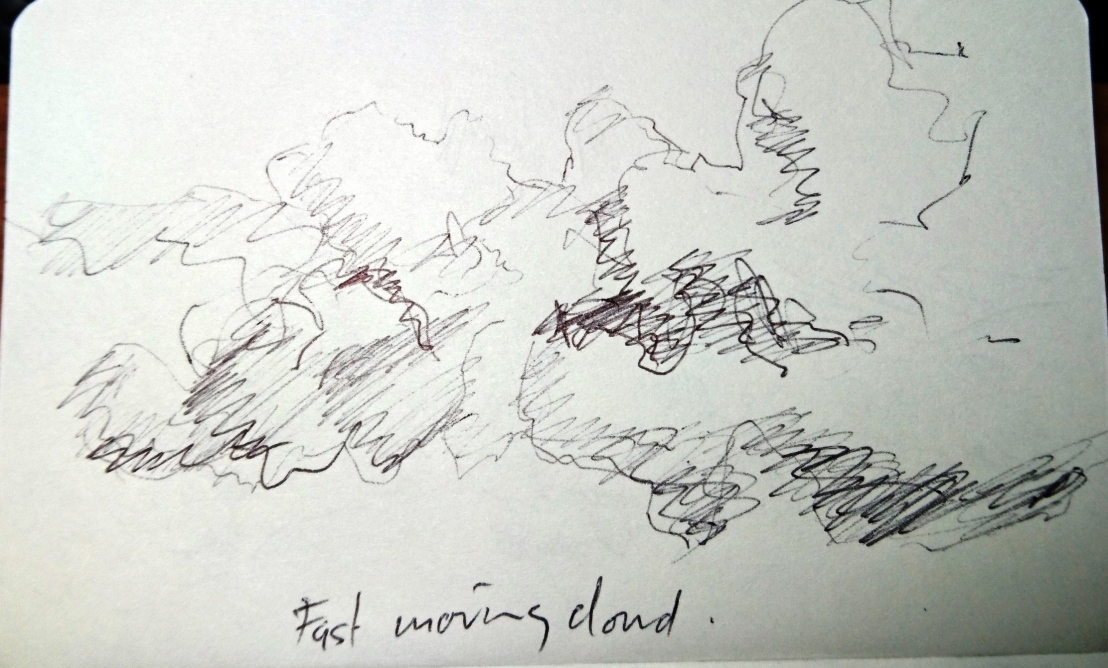
Clouds are constantly moving, forming, dissolving into space – they have a smell and form a damp humid atmostphere – for instance walking or driving on a mountain road in cloud you can experience the sense of capturing or living in the cloud.
This exercise was both frustrating and in a way thrilling – a chance to experiment and to really see if one understands the use of tone or line to represent a three dimensional object even as fleeting as a cloud!
Small sketchbook studies using line…

Cloud mark-making using a twig with indian ink/water…

Experimenting with mixed media/brush using tone…


These studies using a brush were quick but frustratingly unsuccessful.
Thinking about a bigger study and using John Virtue’s London paintings as a guide, I made a cloud study experimenting with a different support…gessoed brown wrapping paper which I had to stretch as it got wetter. This paper is extremely delicate when wet! I then made the cloud study using compressed charcoal:

In this drawing I have captured movement, perspective and form whilst achieving a full tonal range (although this was a little dampened by the application of fixative after taking this photo).
The support is fragile and brittle – and I am now frightened of removing it from the board – it cannot be rolled up and will have to be mounted on card.
Exercise 2 Sketchbook Walk
This for me was a actually a bike ride not a walk. I used a small sketchbook and a fineline biro.

This Polo Club is source of inspiration for me and I look forward to seeing/sketching the horses/riders in action soon. I sketched reasonably quickly trying to incorporate as much detail as possible but trying to create an atmosphere as well – the club house is a restaurant and is actually dwarfed by the mountains and polo fields – although this is not captured in my sketch.

The horse paddocks with mountains in the background has great potential with horses in the foreground, stable blocks and trees in the middleground with mountains and clouds in the background.

I was actually going to make a completely different sketch at this spot but liked the dead tree trunk to use as a frame for the fields, far off buildings and mountains.

I have ridden past this spot many times and was interested in the wooden fruit tree supports that have been left to rot in this abandoned field. The pattern of the supports is repeated in the very large imposing pylons that cross the field. Not sure what the yellow plant is that has invaded this field – perhaps rape seed – it will not be there for long as the hot summer sun will destroy it until next year. This has a potential to develop further and with an architectural feel to the pylons is an opportunity for me to explore the style and methods of Julie Mehretu? Perhaps on Mylar if I can get some.
In the meantime I took lots of photos of the field from many angles and made a watercolour sketch (on a very overcast cold day):

Exercise 3 360deg studies
It was difficult to find time to go out and draw in an expansive landscape but finally I found a location about 30 mins away looking towards the Andes mountains.
It was also difficult to find a safe location to park the car and set up my easel/gear to draw uninterrupted. The day was sunny, hot and cloudless but gave a clear view of the mountains and surrounding countryside.
My drawings were made in my new landscape size 6″ x 12″ 130lb sketchbook in pencil and ink markers:


Some of my direction notes on the drawings were actually incorrect.
The first two sketches captured large chunks of the landscape and the last two homed in on smaller areas. It was as anticipated difficult to capture everything and editing/simplifying was essential, especially in 15 min sketches.
Research Point
Upon researching historic and contemporary artists who work in series with the landscape, I was deeply impressed with the work of John Virtue who I wish to go back to in the next section on Townscapes/Cityscapes. The scale of his works and the way he works up quick small sketches into large scale works is an inspiration. My recent work in indian ink is showing more confidence and I feel ready to go bolder – ever darker with a greater range of tonal contrast. Nicholas Herbert’s work on the Chiltern Hills is too poetic for me although I appreciated his influences from Turners work. Hockney is a favorite and I may use his influence to build an image of my road in the townscape section of this part of the course. In particular his road pictures where he makes a picture about his journeys: Mullholland Drive: The road to the studio, 1980 and The road to Malibu, 1988.
I have been researching the work of Julie Mehetru – an artist that, whilst she is not a landscape artist, she has used architectural drawings and urban spaces in her works on both modest and gigantic scales! Whilst I cannot move to her scale at present, I want to explore working on Mylar and creating similar spaces to her works such as the Untitled. 2000 works found in Drawing Now. Eight Propositions by Laura Hoptmann, 2002 – where she uses coloured pencil, ink and cut paper on Mylar. This will be a challenge for me also because it may mean more controlled use of line and a methodic form of working – well outside of my comfort zone and I could go to A2 maybe. In particular I want to explore her use of what she calls the 3rd space – a space outside of the picture plane swirling, deconstructing and exploding – a space that is also truly three dimensional.


 Here I used a white/pale yellow oil pastel first then painted black acrylic ink over the top – then in the LH image enhanced the image with white soft pastel and then scratched/scraped into the paper to make more interesting destructive marks. In the RH I added black and white pastel marks to the initial drawing. The RH image worked better for me and I captured a couple of the roses better that in the previous one. I need to practice/study individual flowers if I am to draw loosely but accurately!


