Assignment 2 – Still life
During the work making sketches around my home I noticed a particular subject that I wanted to explore – in our lounge dresser we have a collection of souvenirs/presents from around the world – China, Russia, England, Spain and Chile.
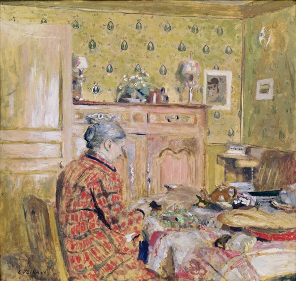
I was also interested in using the idea of a large group of objects as the subject – similar to some of the tables of objects painted by John Bratby – see featured image above (John Bratby. Still life with chip frier, 1954 – detail).
I also wanted to use bold colours – so I explored the use of oil pastel blended/worked with white spirit, and incorporate soft pencil (and line work) also blended with white spirit – to demonstrate use of colour in drawing, accurate and expressive depiction of form, and a range of mark making with contrasts in line, tone, texture and form.
I took many photos of the subject at different angles and because this drawing would be made over several days, I decided to work from photos displayed on my large computer screen – this also meant that I could work at any time of day. The initial exploration/experimentation worked well and I already had an idea of what I wanted in respect of composition…

I then laid out the initial drawing using a 6B pencil and whitespirit…


Then colour was added using oil pastel/6Bpencil…


When I reach what I felt was enough colour, I then reworked the lines and added deeper shadows.
My final drawing….

Reflection:
Assignment 2
The use of colour in drawing: During the course of Part 2 and in particular in this final drawing, I have used colour to render form, to improve depth and to represent accurately the objects drawn.
The most appropriate medium for the subject: In this assignment I have experimented with pencil and oil pastel blended with white spirit – something very new to me. I wanted bold colours in this drawing and I believe that I have achieved this aim. The paper chosen worked well and helped produce textural effects as in the background.
Composition and context: The objects are all housed in a dining room dresser which has large double doors. I wanted to represent both sides of the cupboard using views 90 deg apart. My daughter was a little puzzled by the white space in the middle – which could be seen as strange – however it was intentional. The use of repeated colours and more door showing on the left helped to balance the composition. The objects were not moved at all and were drawn as seen.
The objects are a mixture of sentimental personal items, presents from relatives and souvenirs from my travels abroad.
Mark making and contrasts in line and tone: I have used various mark making techniques in this drawing – including sgrafitti, brushwork in the background, textural marks with oil pastel and line/cross-hatching with pencil, also a combination of brush and line to manipulate the pencil marks in the guardsman’s busby.
Accurate and expressive depiction of form: Within the constraints of the still life subject chosen, I beleive I have achieved an accurate and expressive depiction of form.
Experimentation with idea, material and method: This was certainly a departure from the norm for me and as a method it reminds me of a childrens book illustration (with the teddies) – the material and method was an experimentation which I believe worked except for the fact that the use of a pencil drawing overlaid with bright oil pastel in places became a little muddied.
Part 2 – Intimacy
Part 2 of this course has been an exciting journey exploring many different types of media both wet and dry, and has given me many ideas to use in future work. I have tried to incorporate influences from contemporary artists as well as find my own application of their styles/working methods.
Demonstration of technical and visual skills: My technical and visual skills are improving, but this is held back by the lack of time to practice daily. I work on the course most evenings and more intensely at weekends – family commitments allowing. Part 2 gave me the opportunities to explore subjects that I enjoy – in particular flowers – and use a range of potentially very expressive media that I have previously not used.
Quality of outcome: I was particularly pleased with my still life using pastel, the monochrome study of eggs laid on newspaper, and interior sketches/final interior drawing. They have I believe shown a huge improvement in the quality of my work and demonstrate that I have the ability to achieve a positive/creative outcome to the exercises through creative experimentation/thought processes.
Demonstration of creativity: Whilst I have during this part of the course been creative in use of materials and line work – I have much to learn and still a huge amount to explore further. I will continue to explore and experiment – in particular with some of the methods used by John Piper, Frank Auerbach, William Kentridge, Raoul Dufy and Joan Mitchell.
Context reflection: I need to work on this issue more in the following parts of the course. I have read several books during Part 1 & 2 (this is something I need to reflect on), visited many art galleries and carried out a limited amount of research. I need to include these activities more in the thought processes, methods and preparation of my future work.