
Project 3 Composition
Exercise 1 Developing your studies
This was an interesting part of the course for me and I am not quite sure that I have achieved what is expected at this stage. After reading Contemporary Drawing by Margaret Davidson, and researching Julie Mehretu I thought that I had increased my range of tools and techniques – maybe I have…but not consistently. I am though more aware of my goals.
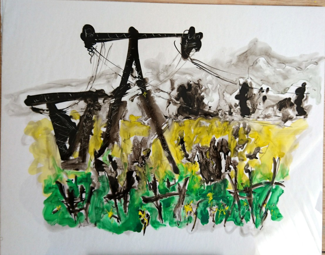
Firstly, I picked the ‘Abandoned field’ sketch from my sketchbook walk to develop further. I liked the repetition of the shape of the pylons in the wooden tree frames in the field. I also felt a connection with this space – I used to walk in open fields when I was about 9-12 years old – often with a sketchbook. The pylons are a connection to my engineering training and an imposing manmade structure in a rural landscape – something that is not often seen in for instance an English landscape. Their were other connections like my interest in aliens and HG Wells’ War of the Worlds – the pylons as the alien invaders, and my weekend bike rides which pass this field.
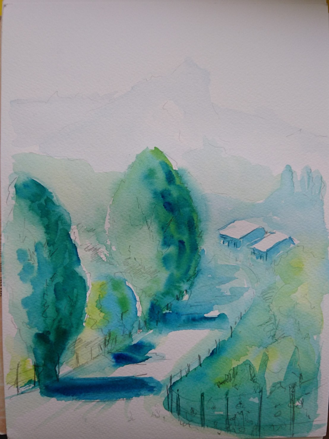
When in the field sketching, I sat on a stool with a very low eye level – see sketch in Project 2. I later made a watercolour sketch but took up a standing position with easel. Additionally I took many photos to review compositional possibilities – all whilst standing!
It was interesting to note that the initial sketch shows the pylons touching the top of the page – towering over me, but in the watercolour, the pylons were not so imposing and my eyelevel was higher and looked over the field from the outside.

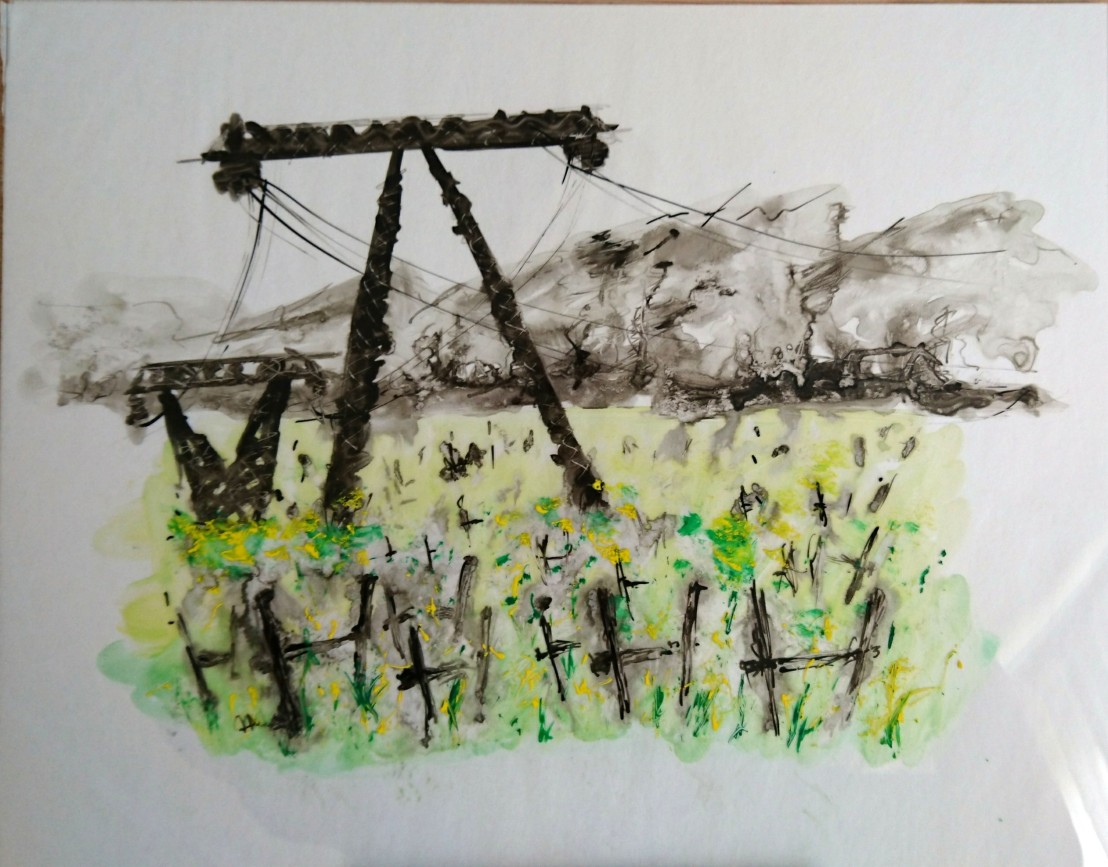
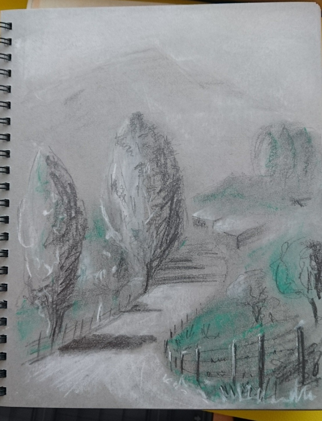
I made a pencil drawing in my sketchbook using as a guide the above watercolour and made notes of my feelings about the drawing:

There were several interesting notes: the use of a limited palette, the smaller pylons reminded me of angels, there was also a feeling of being in a graveyard, the noise of the cables – a crack-crackle/constant humming, and lastly something I may take forward the theme of the letter A upside down forced into the ground.
I decided to experiment with some new Duralar sketchpads bought in the USA. One was for dry media and the other wet media – this trial drawing was by memory – note that I painted the big pylon upside down!:
There were some interesting marks and I liked the indian ink washes that I made in both versions. I need to explore this combination of ink and gouache on Duralar again.
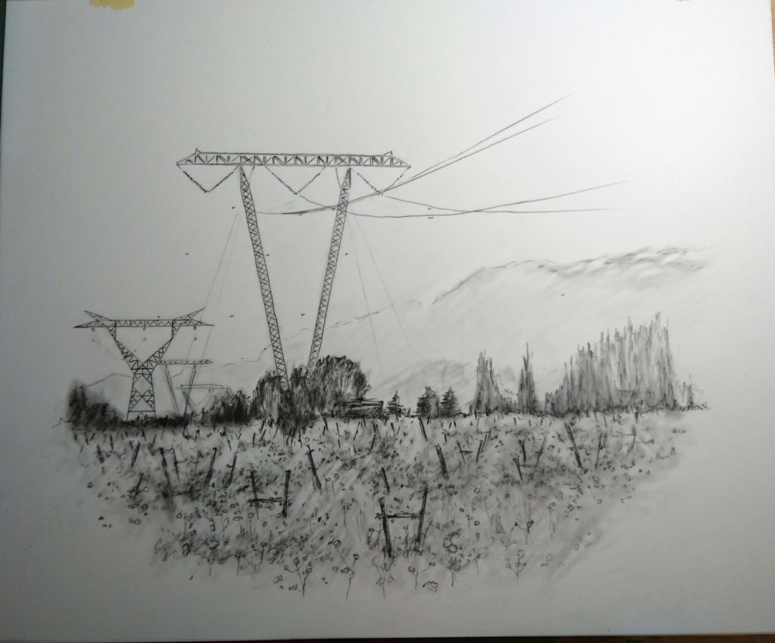
Then I decided to make a finished drawing using a 2B Pencil and coloured pencil on Duralar for dry media combining traced elements, erasing, drawing over erasures, working on the composition, including foreground, middleground and background, and finally including geometric shapes drawn with coloured pencil on the back of the support – using its transparent quality.
Relating this final piece to my recent research on Margaret Davisons book on Contemporary Drawing:
Have I shown the relationship between negative spaces and the forms? The negative spaces in the sky and mountains balance the busy foreground/middlegound, and also there is a connection with this negative space and the forms by means of the connecting cables.
Have I shown a relationship between the surface and the mark? It was my aim with this drawing to work on the smooth Duralar surface and also an intention to use its transparency to trace elements and to use the interesting effects of pencil/coloured pencil on this dry media support. Prior to starting the drawing I made various trial marks on a sheet of the same surface.
Is it clear why I chose certain materials and a particular surface? To me it was clear why I used the surface/materials – there is no relation between the subject and my choice.
Does the scale tell me or the viewer anything? In this case no as it is a normal size.
Have I been clear in how space is depicted? I believe that I have been clear in my use of and depiction of space. The pylons/wooden frames helped in depicting perspective increasing the sense of space, and the large open sky framed the large imposing pylon. The lightly coloured mountains also contributed to depicting distance and scale.
What is the eye level? The eye level is approximately level with the horizon or even a little higher – looking into the field. My initial sketch was low down seated within the wild plants with the pylons as giants towering above. This has not been depicted in the final version.
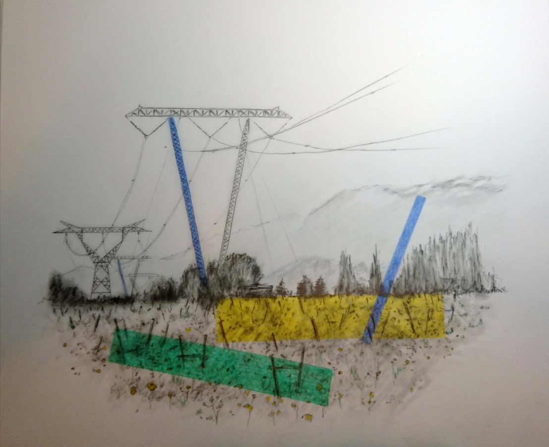
What is the message and is the message clear? I have never been in agreement with the placing of pylons in the countryside, and I feel strongly that they are an impostion although I marvel at the engineering and the power transmitted by the grid. The repetion of the forms – the pylons with the wooden tree supports are clearly the subject – this has worked and is clear in the composition – I also included repetition in the blue lines.
What helps, or hurts, the clarity of the message? The blue lines and the large detailed drawing of the pylons helped the message, the added colours may have distracted the viewer from the message and produced less clarity.
Intentionality: Now this is an interesting issue – yes I did intent to use the materials/ support for this drawing and I believe it was a successful choice. If I am honest the eye level was not chosen it just happened – I need to be more careful with this point. The scale was chosen solely because it was the size of my new sketchpad, although I did have a larger sheet available. The message was intentional but may not have been as clear to the viewer as it was for me.
In conclusion this was an interesting exercise for me and one that I enjoyed.
Exercise 2 Foreground, middleground, background
For this exercise I chose one of my mountain scenes. I chose to draw the scene using 9B graphite in both pencil and block type with chalk on a Strathmore toned grey paper with a medium surface (118g/m2) – size aprox. 22x30cm.
The combination worked well and I drew two copies of the scene – both in terms of the exercise set were not successful:
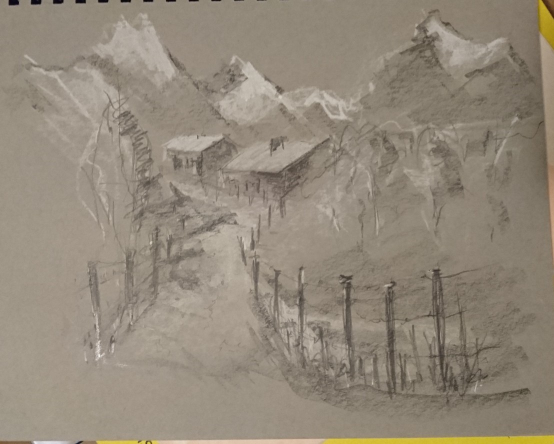
This photo of the drawing does not show the image well and there is greater contrast in the original however I did not structure the drawing the same as Poussin/Lorrain and Turner as asked for. There is more detail in the foreground and the middleground is shown by the houses although they have nearly the same tone/level of detail as the foreground. The background mountains should be less clearly defined and shaded lighter to make them almost fade into the sky.
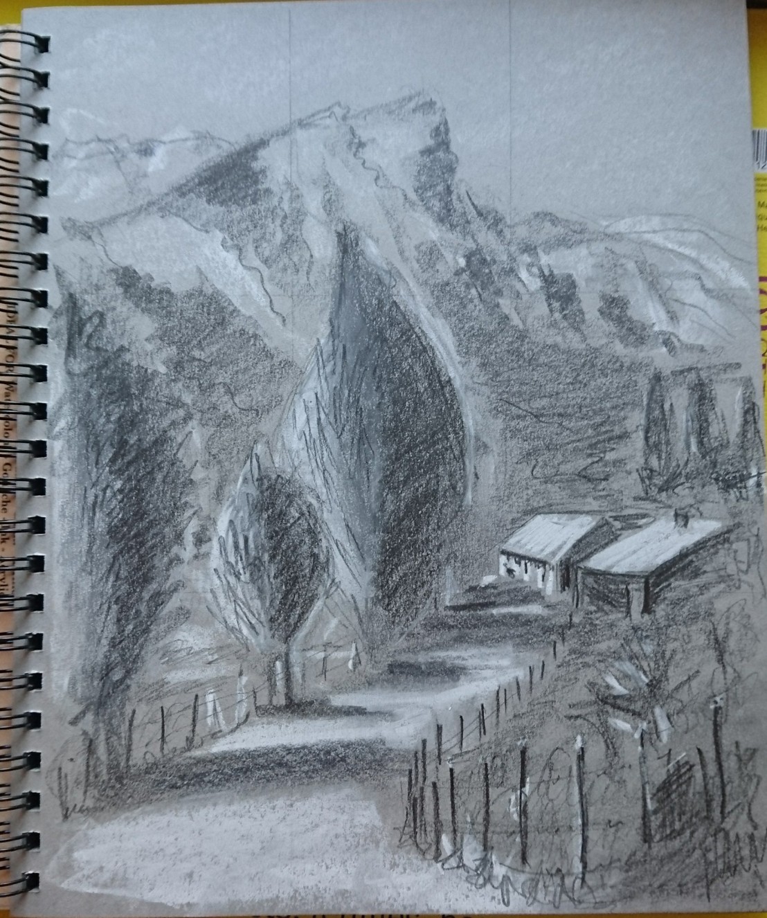
The second drawing in portrait format again had the same faults although this time I tried to incorporate more tonal contrast:
I then searched among my books to find a suitable example to use as a guide.
I liked some of the examples from JWM Turners watercolour sketches – delicate masterpieces with depth:
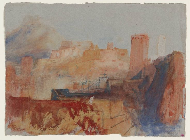
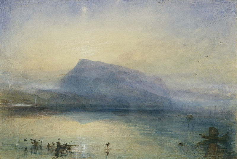
These two examples do not have much detail in the foreground but just enough to show greater definition in a darker tone, then examples of middleground touching the edge of the image and much lighter tones in the background.
I needed to create something similar:
In this version, I introduced a little green pastel. This was more successful in creating depth – removing the excessive detail in the houses, leaving in the line of trees to the left and keeping the mountains middle grey. I also lightened the sky to outline the mountains.
I need to improve and practice on this technique much more.
Reflecting on the last two exercises
On reflection, I was happy with my work in the first exercise but deeply lacked practice in the second.
I was able to select simple shapes in the second exercise but it was obvious that I relied again on line more than tone! In Turners watercolours there is almost a total absence of line and he creates depth entirely by using tone – adding a small amount of detail in the foreground.
In the first exercise I did create depth and was happy with my experimentation and final image. Again I was able to simplify the large landscape.
In the first image There was a sense of depth/distance but not form. In the second I did manage to represent form but relied too much on line to help me.
In the first exercise I did not use the light at all! This was probably due to drawing and photography the scene on dull cloudy days and at a time when the sun was highest – no shadows.
In the second exercise I was more aware of the effect of the bright light on the scene and used it to create form – successfully? – no. Why? – because I relied on line.
Additionally I should make more smaller detailed sketches of the scene to record detail, shapes, tonal contrasts, and choose the correct time of day when the light shows off the form best. Many of Turners watercolours are of sunrise and sunset – beautiful colours and long contrasting shadows. Make more tonal studies of buildings, landscapes and natural features such as rocks and mountains.
As I was not happy with the second exercise I decided to redraw it again but this time in watercolour avoiding the use of line until the end:
This final drawing was much more in line with the brief and I achieved a much greater sense of depth using tone! Must practice and push myself more.
